Color
Deskblocks uses a color system to simplify color management and application, allowing designers and developers to focus on features rather than the complexities of color.
Color System
Managing colors for an app that supports multiple themes (blue, red, green, orange, yellow), along with light & dark modes, and various contrast levels can be complex. Deskblocks addresses this with a semantic color system, which automates color management, enabling developers to focus on building features.
Note:
Curious about the inner workings of the color system? Check out the article Building an accessible color system to learn more.
Semantic Color Token
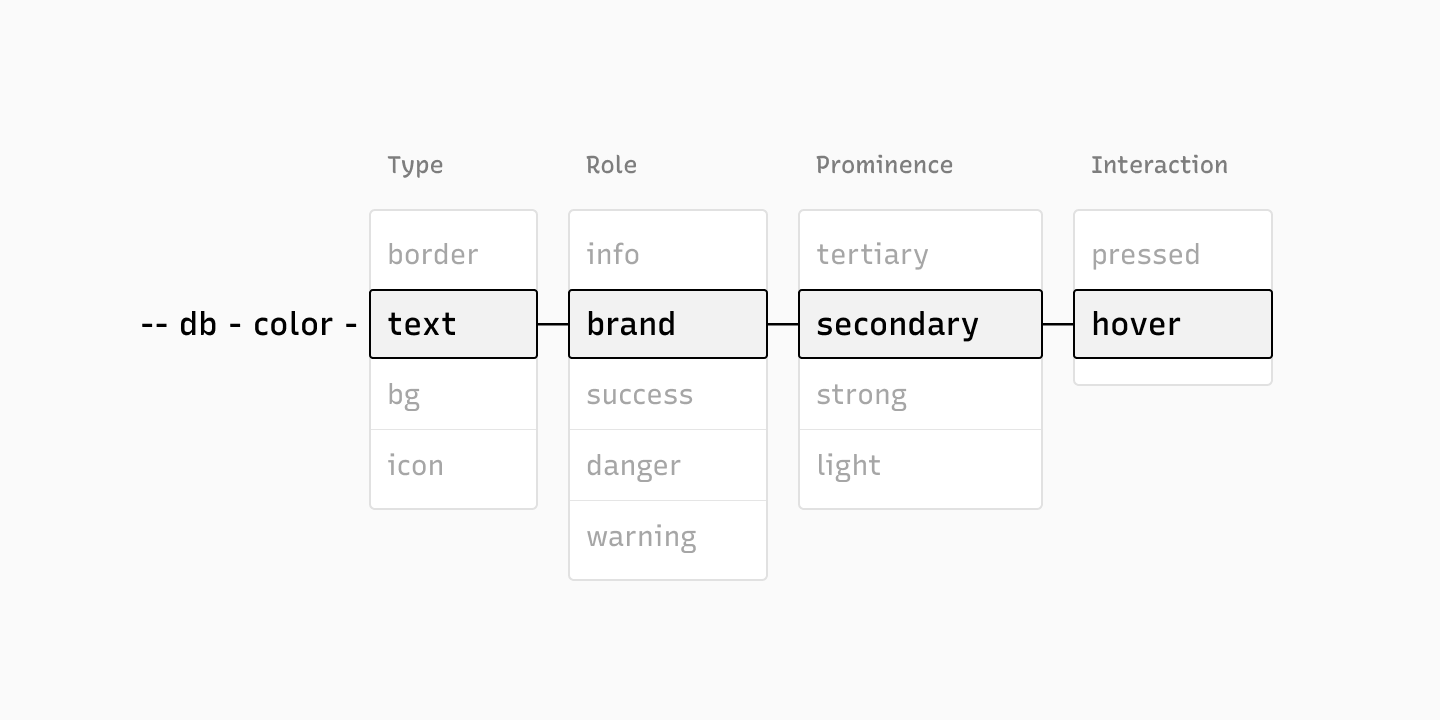
The semantic token system organizes colors logically for easy application. While it might seem extensive at first, its consistent structure simplifies use. All tokens follow the same semantic structure.
--db-color-{type}-{role}-{prominence}-{interaction} In this structure, db acts as the namespace, representing ‘deskblocks,’ followed by the keyword ‘color’ and additional parameters specifies the type, role, prominence, and interaction. Among these, only ‘type’ is mandatory, while the others are optional.
Type (required)
The type parameter specifies the type of element that is being colored. There are four possible values for type:
- bg: Background color
- text: Text color
- icon: Icon color
- border: Border color
--db-color-bg --db-color-text --db-color-icon --db-color-border
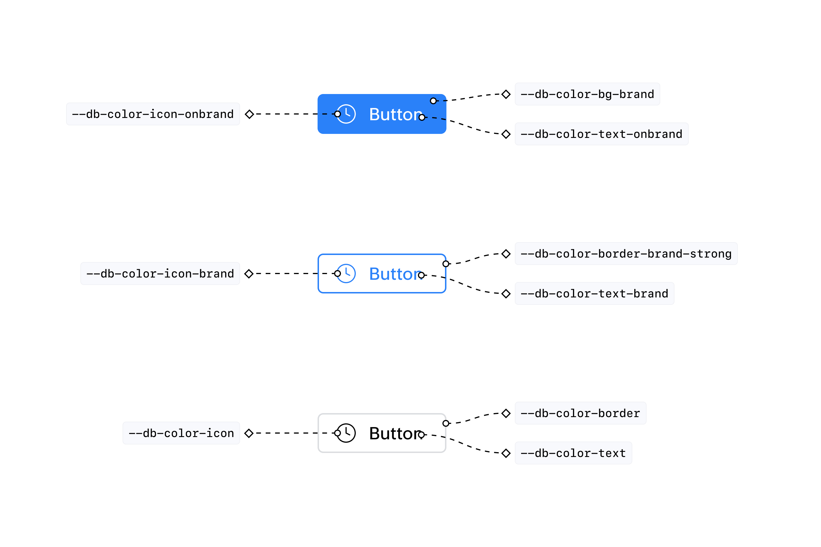
Role (optional)
Roles are a way to define the underlying hue based on its intended use rather than the specific color. For example, a success message uses a green background, so instead of labeling it as --db-color-bg-green , it’s called --db-color-bg-success . Here are a few examples.
--db-color-bg-brand --db-color-text-info --db-color-border-warning --db-color-icon-danger
The possible values for the role parameter are:
- Brand: A dynamic hue that adapts to the current theme color. For eg, "--db-color-bg-brand" may start as primary blue, but if the user switches to a green theme, it will change to green.
- Info : A blue hue used to convey information.
- Success: A green hue used to indicate confirmation or approval.
- Danger: A red hue used to signal errors or destructive actions.
- Warning: An orange hue used to alert users to potential problems.
- Disabled: A light grey hue used for inactive buttons, text, borders, and icons.
- Selected: A dynamic hue, similar to the brand color, used for backgrounds and borders of selected elements, adjusting based on the current theme.
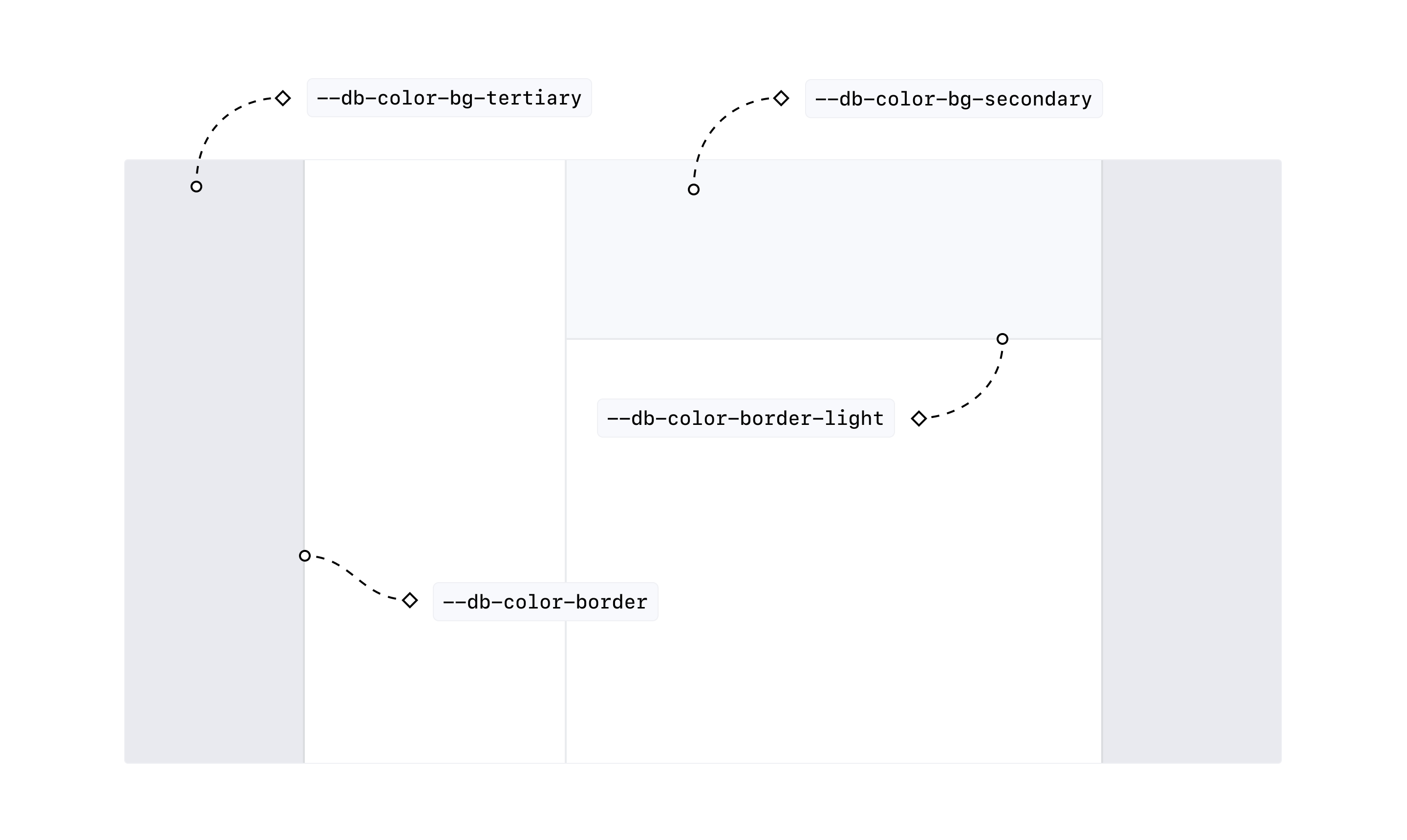
Prominence (optional)
To establish hierarchy and adjust visual emphasis, bg, text, and icon elements can be modified with secondary and tertiary variations. Similarly, for borders, there are three options: the default option, which doesn’t require a modifier --db-color-border can be used as for standard divider, strong for a darker border, and light for a lighter border.
--db-color-text-secondary --db-color-bg-brand-secondary --db-color-icon-tertiary --db-color-border-light --db-color-border --db-color-border-strong
Interaction (optional)
The interaction state of an element can be modified using the hover and pressed modifiers.
--db-color-bg-brand-pressed --db-color-text-danger-hover
Selective Theming
To apply custom styles for specific themes or appearances, use CSS classes to target them. The root element dynamically adds classes like theme-blue and appearance-light based on the current theme and appearance.
For example, to style a node specifically for dark mode and red theme, use the following CSS:
:global(.theme-red.appearance-dark div) {
  /* Your styles here */
}
Color Token Usage Examples
Color Tokens
Background
| Variable | Blue | Red | Green | Orange | Yellow |
|---|---|---|---|---|---|
--db-color-bg | #ffffff | #ffffff | #ffffff | #ffffff | #ffffff |
--db-color-bg-hover | #f7f9fc | #fbf9fa | #f6fafa | #fbf9f7 | #faf9f6 |
--db-color-bg-pressed | #eff1f4 | #f2f0f1 | #edf1f1 | #f2f0ee | #f1f1ee |
--db-color-bg-secondary | #f7f9fc | #fbf9fa | #f6fafa | #fbf9f7 | #faf9f6 |
--db-color-bg-secondary-hover | #eff1f4 | #f2f0f1 | #edf1f1 | #f2f0ee | #f1f1ee |
--db-color-bg-tertiary | #e9ebee | #eceaeb | #e8ecec | #edebe9 | #ebebe8 |
--db-color-bg-tertiary-hover | #e0e3e6 | #e4e2e3 | #dfe3e3 | #e4e2e0 | #e2e3e0 |
--db-color-bg-inverse | #2d3133 | #2d3133 | #2d3133 | #2d3133 | #2d3133 |
--db-color-bg-disabled | #eff1f4 | #f2f0f1 | #edf1f1 | #f2f0ee | #f1f1ee |
--db-color-bg-selected | #f5f6ff | #fff4f3 | #d4ffee | #fff4f0 | #fff5e7 |
--db-color-bg-selected-hover | #edf0ff | #ffedeb | #b0ffe2 | #ffede4 | #ffefd2 |
--db-color-bg-selected-pressed | #edf0ff | #ffedeb | #b0ffe2 | #ffede4 | #ffefd2 |
--db-color-bg-brand | #2a81f9 | #f04340 | #029934 | #cf6700 | #a57e00 |
--db-color-bg-brand-hover | #2968c6 | #c13937 | #237a30 | #a35613 | #846611 |
--db-color-bg-brand-pressed | #335da4 | #a43b37 | #2e6b33 | #8c4f1f | #745b1a |
--db-color-bg-brand-secondary | #f5f6ff | #fff4f3 | #d4ffee | #fff4f0 | #fff5e7 |
--db-color-bg-brand-disabled | #acc7ff | #ffb3ad | #33e288 | #ffb787 | #f0c044 |
--db-color-bg-info | #2a81f9 | #2a81f9 | #2a81f9 | #2a81f9 | #2a81f9 |
--db-color-bg-info-hover | #2968c6 | #2968c6 | #2968c6 | #2968c6 | #2968c6 |
--db-color-bg-info-pressed | #335da4 | #335da4 | #335da4 | #335da4 | #335da4 |
--db-color-bg-info-secondary | #f5f6ff | #f5f6ff | #f5f6ff | #f5f6ff | #f5f6ff |
--db-color-bg-info-disabled | #acc7ff | #acc7ff | #acc7ff | #acc7ff | #acc7ff |
--db-color-bg-success | #029934 | #029934 | #029934 | #029934 | #029934 |
--db-color-bg-success-hover | #237a30 | #237a30 | #237a30 | #237a30 | #237a30 |
--db-color-bg-success-pressed | #2e6b33 | #2e6b33 | #2e6b33 | #2e6b33 | #2e6b33 |
--db-color-bg-success-secondary | #d4ffee | #d4ffee | #d4ffee | #d4ffee | #d4ffee |
--db-color-bg-success-disabled | #33e288 | #33e288 | #33e288 | #33e288 | #33e288 |
--db-color-bg-warning | #cf6700 | #cf6700 | #cf6700 | #cf6700 | #cf6700 |
--db-color-bg-danger | #f04340 | #f04340 | #f04340 | #f04340 | #f04340 |
--db-color-bg-danger-hover | #c13937 | #c13937 | #c13937 | #c13937 | #c13937 |
--db-color-bg-danger-pressed | #a43b37 | #a43b37 | #a43b37 | #a43b37 | #a43b37 |
--db-color-bg-danger-secondary | #fff4f3 | #fff4f3 | #fff4f3 | #fff4f3 | #fff4f3 |
--db-color-bg-danger-disabled | #ffb3ad | #ffb3ad | #ffb3ad | #ffb3ad | #ffb3ad |
--db-color-bg-chip | #e9ebee | #eceaeb | #e8ecec | #edebe9 | #ebebe8 |
--db-color-bg-chip-hover | #e0e3e6 | #e4e2e3 | #dfe3e3 | #e4e2e0 | #e2e3e0 |
--db-color-bg-chip-disabled | #eff1f4 | #f2f0f1 | #edf1f1 | #f2f0ee | #f1f1ee |
--db-color-bg-switch-active | #029934 | #029934 | #029934 | #029934 | #029934 |
--db-color-bg-switch-active-hover | #237a30 | #237a30 | #237a30 | #237a30 | #237a30 |
--db-color-bg-switch-active-disabled | #33e288 | #33e288 | #33e288 | #33e288 | #33e288 |
--db-color-bg-switch-inactive | #dbdde0 | #dedcdd | #d9dede | #dedcdb | #ddddda |
--db-color-bg-switch-inactive-hover | #c4c7ca | #c7c6c7 | #c3c7c7 | #c3c7c7 | #c6c7c4 |
--db-color-bg-switch-inactive-disabled | #eff1f4 | #f2f0f1 | #edf1f1 | #f2f0ee | #f1f1ee |
--db-color-bg-warning-hover | #a35613 | #a35613 | #a35613 | #a35613 | #a35613 |
--db-color-bg-warning-pressed | #8c4f1f | #8c4f1f | #8c4f1f | #8c4f1f | #8c4f1f |
--db-color-bg-warning-secondary | #fff4f0 | #fff4f0 | #fff4f0 | #fff4f0 | #fff4f0 |
--db-color-bg-warning-disabled | #ffb787 | #ffb787 | #ffb787 | #ffb787 | #ffb787 |
Text
| Variable | Blue | Red | Green | Orange | Yellow |
|---|---|---|---|---|---|
--db-color-text-brand | #2a81f9 | #f04340 | #029934 | #cf6700 | #a57e00 |
--db-color-text-brand-hover | #2968c6 | #c13937 | #237a30 | #a35613 | #846611 |
--db-color-text-brand-pressed | #335da4 | #a43b37 | #2e6b33 | #8c4f1f | #745b1a |
--db-color-text-brand-secondary | #7fabff | #ff8980 | #39c35f | #ff8e35 | #d2a529 |
--db-color-text-brand-disabled | #acc7ff | #ffb3ad | #33e288 | #ffb787 | #f0c044 |
--db-color-text-onbrand | #ffffff | #ffffff | #ffffff | #ffffff | #ffffff |
--db-color-text-info | #2a81f9 | #2a81f9 | #2a81f9 | #2a81f9 | #2a81f9 |
--db-color-text-info-hover | #2968c6 | #2968c6 | #2968c6 | #2968c6 | #2968c6 |
--db-color-text-info-pressed | #335da4 | #335da4 | #335da4 | #335da4 | #335da4 |
--db-color-text-info-secondary | #7fabff | #7fabff | #7fabff | #7fabff | #7fabff |
--db-color-text-info-disabled | #acc7ff | #acc7ff | #acc7ff | #acc7ff | #acc7ff |
--db-color-text-oninfo | #ffffff | #ffffff | #ffffff | #ffffff | #ffffff |
--db-color-text-success | #029934 | #029934 | #029934 | #029934 | #029934 |
--db-color-text-success-hover | #237a30 | #237a30 | #237a30 | #237a30 | #237a30 |
--db-color-text-success-pressed | #2e6b33 | #2e6b33 | #2e6b33 | #2e6b33 | #2e6b33 |
--db-color-text-success-secondary | #39c35f | #39c35f | #39c35f | #39c35f | #39c35f |
--db-color-text-success-disabled | #33e288 | #33e288 | #33e288 | #33e288 | #33e288 |
--db-color-text-onsuccess | #ffffff | #ffffff | #ffffff | #ffffff | #ffffff |
--db-color-text-warning | #cf6700 | #cf6700 | #cf6700 | #cf6700 | #cf6700 |
--db-color-text-warning-hover | #a35613 | #a35613 | #a35613 | #a35613 | #a35613 |
--db-color-text-warning-pressed | #8c4f1f | #8c4f1f | #8c4f1f | #8c4f1f | #8c4f1f |
--db-color-text-warning-secondary | #ff8e35 | #ff8e35 | #ff8e35 | #ff8e35 | #ff8e35 |
--db-color-text-warning-disabled | #ffb787 | #ffb787 | #ffb787 | #ffb787 | #ffb787 |
--db-color-text-onwarning | #ffffff | #ffffff | #ffffff | #ffffff | #ffffff |
--db-color-text-danger | #f04340 | #f04340 | #f04340 | #f04340 | #f04340 |
--db-color-text-danger-hover | #c13937 | #c13937 | #c13937 | #c13937 | #c13937 |
--db-color-text-danger-pressed | #a43b37 | #a43b37 | #a43b37 | #a43b37 | #a43b37 |
--db-color-text-danger-secondary | #ff8980 | #ff8980 | #ff8980 | #ff8980 | #ff8980 |
--db-color-text-danger-disabled | #ffb3ad | #ffb3ad | #ffb3ad | #ffb3ad | #ffb3ad |
--db-color-text-ondanger | #ffffff | #ffffff | #ffffff | #ffffff | #ffffff |
--db-color-text | #000000 | #000000 | #000000 | #000000 | #000000 |
--db-color-text-secondary | #5b5f61 | #5e5e5f | #5a5f5f | #5e5e5d | #5d5f5d |
--db-color-text-tertiary | #818487 | #848384 | #808585 | #848482 | #838482 |
--db-color-text-disabled | #c4c7ca | #c7c6c7 | #c3c7c7 | #c8c6c4 | #c6c7c4 |
--db-color-text-placeholder | #c4c7ca | #c7c6c7 | #c3c7c7 | #c8c6c4 | #c6c7c4 |
--db-color-text-oninverse | #ffffff | #ffffff | #ffffff | #ffffff | #ffffff |
Border
| Variable | Blue | Red | Green | Orange | Yellow |
|---|---|---|---|---|---|
--db-color-border-brand | #cfddff | #ffd3ce | #18fbb1 | #ffd4ba | #ffd87e |
--db-color-border-info | #cfddff | #cfddff | #cfddff | #cfddff | #cfddff |
--db-color-border-info-hover | #2a81f9 | #2a81f9 | #2a81f9 | #2a81f9 | #2a81f9 |
--db-color-border-info-light | #e4ebff | #e4ebff | #e4ebff | #e4ebff | #e4ebff |
--db-color-border-info-strong | #2a81f9 | #2a81f9 | #2a81f9 | #2a81f9 | #2a81f9 |
--db-color-border-info-strong-hover | #2968c6 | #2968c6 | #2968c6 | #2968c6 | #2968c6 |
--db-color-border-info-disabled | #e4ebff | #e4ebff | #e4ebff | #e4ebff | #e4ebff |
--db-color-border-brand-hover | #2a81f9 | #f04340 | #029934 | #cf6700 | #a57e00 |
--db-color-border-brand-light | #e4ebff | #ffe5e3 | #83ffd3 | #ffe6d8 | #ffe9bb |
--db-color-border-brand-strong | #2a81f9 | #f04340 | #029934 | #cf6700 | #a57e00 |
--db-color-border-brand-strong-hover | #2968c6 | #c13937 | #237a30 | #a35613 | #846611 |
--db-color-border-brand-disabled | #e4ebff | #ffe5e3 | #83ffd3 | #ffe6d8 | #ffe9bb |
--db-color-border-success | #18fbb1 | #18fbb1 | #18fbb1 | #18fbb1 | #18fbb1 |
--db-color-border-success-hover | #029934 | #029934 | #029934 | #029934 | #029934 |
--db-color-border-success-light | #83ffd3 | #83ffd3 | #83ffd3 | #83ffd3 | #83ffd3 |
--db-color-border-success-strong | #029934 | #029934 | #029934 | #029934 | #029934 |
--db-color-border-success-strong-hover | #237a30 | #237a30 | #237a30 | #237a30 | #237a30 |
--db-color-border-warning | #ffd4ba | #ffd4ba | #ffd4ba | #ffd4ba | #ffd4ba |
--db-color-border-danger | #ffd3ce | #ffd3ce | #ffd3ce | #ffd3ce | #ffd3ce |
--db-color-border-danger-hover | #f04340 | #f04340 | #f04340 | #f04340 | #f04340 |
--db-color-border-danger-light | #ffe5e3 | #ffe5e3 | #ffe5e3 | #ffe5e3 | #ffe5e3 |
--db-color-border-danger-strong | #f04340 | #f04340 | #f04340 | #f04340 | #f04340 |
--db-color-border-danger-strong-hover | #c13937 | #c13937 | #c13937 | #c13937 | #c13937 |
--db-color-border-danger-disabled | #ffe5e3 | #ffe5e3 | #ffe5e3 | #ffe5e3 | #ffe5e3 |
--db-color-border-warning-hover | #cf6700 | #cf6700 | #cf6700 | #cf6700 | #cf6700 |
--db-color-border-warning-light | #ffe6d8 | #ffe6d8 | #ffe6d8 | #ffe6d8 | #ffe6d8 |
--db-color-border-success-disabled | #83ffd3 | #83ffd3 | #83ffd3 | #83ffd3 | #83ffd3 |
--db-color-border-warning-strong | #cf6700 | #cf6700 | #cf6700 | #cf6700 | #cf6700 |
--db-color-border-warning-strong-hover | #a35613 | #a35613 | #a35613 | #a35613 | #a35613 |
--db-color-border-warning-disabled | #ffe6d8 | #ffe6d8 | #ffe6d8 | #ffe6d8 | #ffe6d8 |
--db-color-border | #dbdde0 | #dedcdd | #d9dede | #dedcdb | #ddddda |
--db-color-border-hover | #818487 | #848384 | #808585 | #848482 | #838482 |
--db-color-border-light | #e9ebee | #eceaeb | #e8ecec | #edebe9 | #ebebe8 |
--db-color-border-strong | #818487 | #848384 | #808585 | #848482 | #838482 |
--db-color-border-disabled | #e9ebee | #eceaeb | #e8ecec | #edebe9 | #ebebe8 |
--db-color-border-focus | #7fabff | #ff8980 | #39c35f | #ff8e35 | #ffce51 |
--db-color-border-oninverse | #44474a | #44474a | #44474a | #44474a | #44474a |
Icon
| Variable | Blue | Red | Green | Orange | Yellow |
|---|---|---|---|---|---|
--db-color-icon-brand | #2a81f9 | #f04340 | #029934 | #cf6700 | #a57e00 |
--db-color-icon-brand-hover | #2968c6 | #c13937 | #237a30 | #a35613 | #846611 |
--db-color-icon-brand-pressed | #335da4 | #a43b37 | #2e6b33 | #8c4f1f | #745b1a |
--db-color-icon-brand-disabled | #acc7ff | #ffb3ad | #33e288 | #ffb787 | #f0c044 |
--db-color-icon-onbrand | #ffffff | #ffffff | #ffffff | #ffffff | #ffffff |
--db-color-icon-info | #2a81f9 | #2a81f9 | #2a81f9 | #2a81f9 | #2a81f9 |
--db-color-icon-info-hover | #2968c6 | #2968c6 | #2968c6 | #2968c6 | #2968c6 |
--db-color-icon-info-pressed | #335da4 | #335da4 | #335da4 | #335da4 | #335da4 |
--db-color-icon-info-disabled | #acc7ff | #acc7ff | #acc7ff | #acc7ff | #acc7ff |
--db-color-icon-oninfo | #ffffff | #ffffff | #ffffff | #ffffff | #ffffff |
--db-color-icon-success | #029934 | #029934 | #029934 | #029934 | #029934 |
--db-color-icon-success-hover | #237a30 | #237a30 | #237a30 | #237a30 | #237a30 |
--db-color-icon-success-pressed | #2e6b33 | #2e6b33 | #2e6b33 | #2e6b33 | #2e6b33 |
--db-color-icon-success-disabled | #33e288 | #33e288 | #33e288 | #33e288 | #33e288 |
--db-color-icon-onsuccess | #ffffff | #ffffff | #ffffff | #ffffff | #ffffff |
--db-color-icon-warning | #cf6700 | #cf6700 | #cf6700 | #cf6700 | #cf6700 |
--db-color-icon-warning-hover | #a35613 | #a35613 | #a35613 | #a35613 | #a35613 |
--db-color-icon-warning-pressed | #8c4f1f | #8c4f1f | #8c4f1f | #8c4f1f | #8c4f1f |
--db-color-icon-warning-disabled | #ffb787 | #ffb787 | #ffb787 | #ffb787 | #ffb787 |
--db-color-icon-onwarning | #ffffff | #ffffff | #ffffff | #ffffff | #ffffff |
--db-color-icon-danger | #f04340 | #f04340 | #f04340 | #f04340 | #f04340 |
--db-color-icon-danger-hover | #c13937 | #c13937 | #c13937 | #c13937 | #c13937 |
--db-color-icon-danger-pressed | #a43b37 | #a43b37 | #a43b37 | #a43b37 | #a43b37 |
--db-color-icon-danger-disabled | #ffb3ad | #ffb3ad | #ffb3ad | #ffb3ad | #ffb3ad |
--db-color-icon-ondanger | #ffffff | #ffffff | #ffffff | #ffffff | #ffffff |
--db-color-icon | #000000 | #000000 | #000000 | #000000 | #000000 |
--db-color-icon-hover | #000000 | #000000 | #000000 | #000000 | #000000 |
--db-color-icon-interactive-hover | #2a81f9 | #f04340 | #029934 | #cf6700 | #a57e00 |
--db-color-icon-pressed | #000000 | #000000 | #000000 | #000000 | #000000 |
--db-color-icon-secondary | #5b5f61 | #5e5e5f | #5a5f5f | #5e5e5d | #5d5f5d |
--db-color-icon-secondary-hover | #000000 | #000000 | #000000 | #000000 | #000000 |
--db-color-icon-tertiary | #818487 | #848384 | #808585 | #848482 | #838482 |
--db-color-icon-tertiary-hover | #000000 | #000000 | #000000 | #000000 | #000000 |
--db-color-icon-selected | #2a81f9 | #f04340 | #029934 | #cf6700 | #a57e00 |
--db-color-icon-oninverse | #ffffff | #ffffff | #ffffff | #ffffff | #ffffff |
--db-color-icon-disabled | #c4c7ca | #c7c6c7 | #c3c7c7 | #c8c6c4 | #c6c7c4 |